Introduction
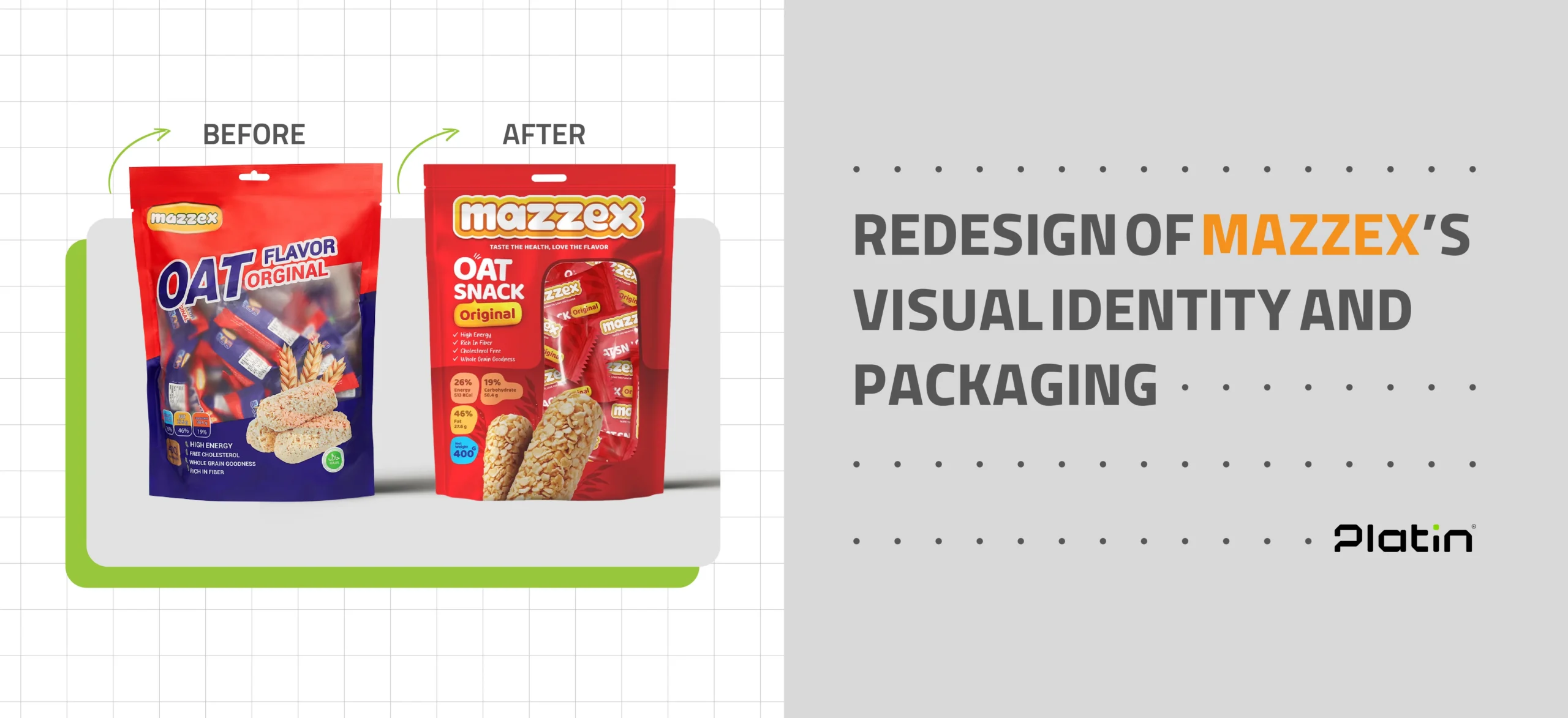
Mazzex, a brand specializing in healthy oat-based snacks, partnered with Platin Agency to introduce its new product line to the market. One of the brand’s main requirements was to design packaging that would stand out clearly on store shelves while communicating the product’s authenticity to consumers. This was particularly crucial because, in the previous packaging design, the brand name “Mazzex” was not given enough prominence. Instead, the word “OAT” was displayed in large, bold lettering, which created opportunities for unauthorized producers to misuse the term and flood the market with counterfeit products leveraging the “OAT” label, undermining Mazzex’s brand integrity.
Research and Insights
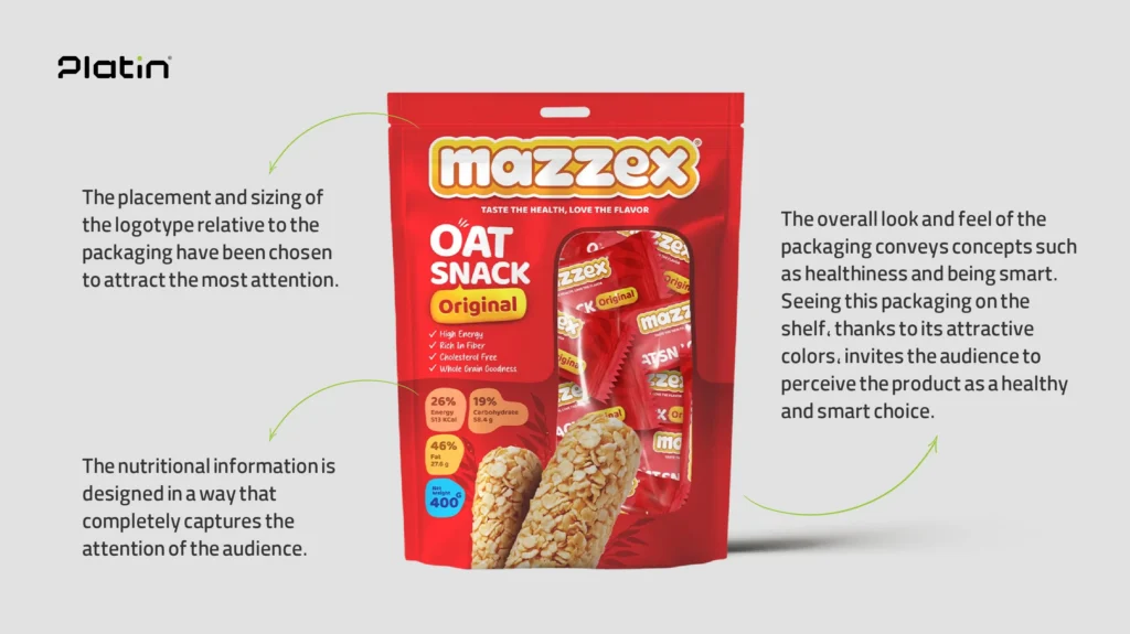
Extensive research revealed the core qualities of the Mazzex brand: its products are natural, energizing, and healthy. In addition, the concept of “enthusiasm” was identified as a defining element of the brand’s identity. Audience analysis further showed that consumers want to clearly see what is inside the packaging. Product information is highly important to them — particularly details about fat content, ingredients, and other nutritional attributes. Consumers also expect the product name to be highly visible and prominently placed on the packaging for easy recognition.
Strategy
The main strategy was to ensure that the packaging would stand out on crowded store shelves and immediately draw customers’ attention. It was also clear that the “Mazzex” brand name needed to be far more prominent to strengthen consumer trust and brand recognition. Therefore, the final design prioritized making the “Mazzex” logo more noticeable while reducing the size of the “OAT” word, which had previously overshadowed the brand name. Given the product’s healthy nature, which might not automatically spark excitement at first glance, we decided to incorporate a dynamic and energetic concept into the visual identity to attract consumers more effectively.
Leave a Reply