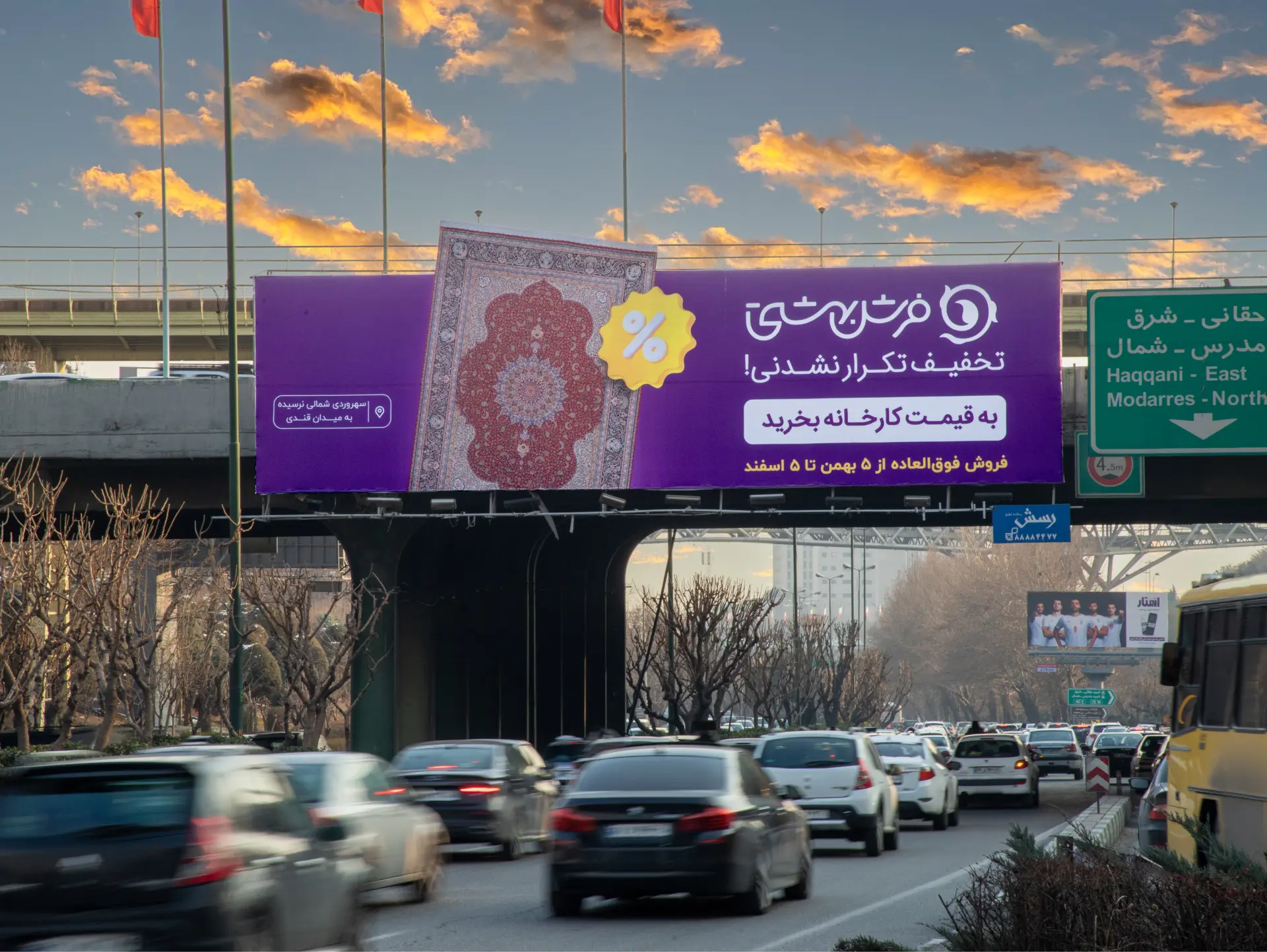
In the highly competitive carpet industry, which is one of the most well-established industries in Iran and where costumers have a thorough understanding of the product, being a manufacturer not only adds value to the national economy but also provides an opportunity to create unique value propositions for customers and develop competitive strategies. Beheshti Carpet, one of the largest carpet manufacturers in Iran, has consistently had a strong presence in both the Iranian market and international forums, seizing opportunities to create value, each year. Now, after providing easy purchase facilities and conditions for its customers, the company is looking to seize a new opportunity as a manufacturer. The Platin team, using intelligence and agility, recognized the market potential around the New Year, concluded that leveraging the brand’s diverse and beautiful designs along with a clear slogan entirely focused on sales and brand positioning could have a significant impact on carpet sales and the market. To this end, after national carpet market studies, competitors analysis, and audience insights analysis, we came up with the slogan “Buy at Factory Prices” to ensure that, through OOH media, in-store displays, and TVC, the audience is quickly aware of the mega sales festival of one of the industry’s largest manufacturers! Platin is proud to have accompanied such a reputable brand as Beheshti Carpet throughout this journey, leveraging the expertise of its human capital.
Category: Case Study
-
Rebranding of Leili Pastry
Introduction
Lily Pastry, with over 10 years of experience in modern pastry-making (industrial production and distribution) and product-oriented cafe management, decided to undergo a major transformation in order to deepen its connection with customers and attract and retain the new generation of consumers. This transformation eventually took the form of a comprehensive rebranding.
The first phase of this rebranding involved redesigning the communication strategy, creating a cohesive visual identity, and revamping the packaging and store appearances. The goal was to transform Leili into a brand that evokes joy for its customers. -
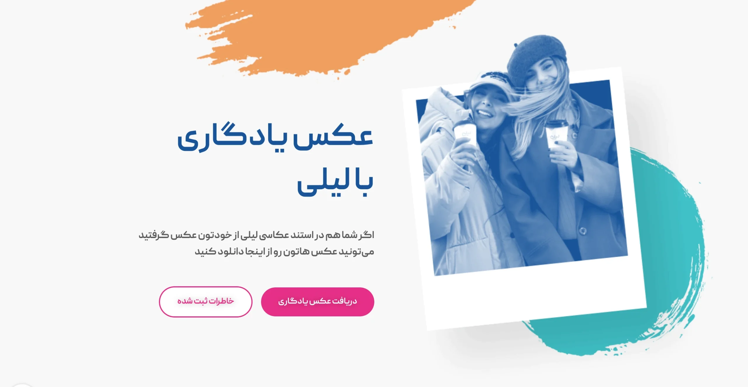
Leili Kiosk
IntroductionThe History of Leili Brand and the Success of the Rebranding Campaign
Leili, a brand with over a decade of remarkable experience in modern modern pastry-making (systematic factory baking and distribution) and product-oriented café management, has always been recognized as a symbol of quality and innovation in the food industry. With more than two decades of experience and a decade of active market presence, Leili has solidified its place in the hearts of customers through creative and high-quality products. The recent rebranding campaign, aimed at redefining the brand and connecting better with the new generation, marked a significant milestone in Leili’s history. This campaign was met with widespread enthusiasm and successfully attracted a larger audience by positively reshaping the brand’s image.
Objectives and Vision for the Second Campaign
Following the success of the rebranding campaign, Leili launched a second campaign with the goal of expanding its influence and solidifying its new brand position. This campaign was designed with a dual purpose: first, to strengthen relationships with existing customers, and second, to attract new audiences and broaden the brand’s customer base. The vision for the campaign focused on reinforcing Leili’s branding by emphasizing values of innovation, quality, and customer experience.
Target Audience IdentificationIdentifying the Target Audience: Travelers and Locals of the Mazandaran Region
In this campaign, the target audience was carefully identified and defined. Considering the increase in domestic travel to Mazandaran Province during June, travelers to this region and local residents who host tourists were recognized as the primary audience. This selection provided an opportunity for direct engagement with target groups outside traditional retail settings.
-
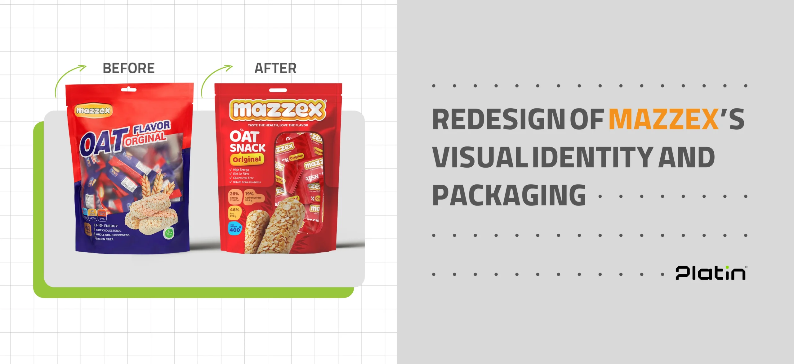
Mazzex Brand Redesign and Packaging
Introduction
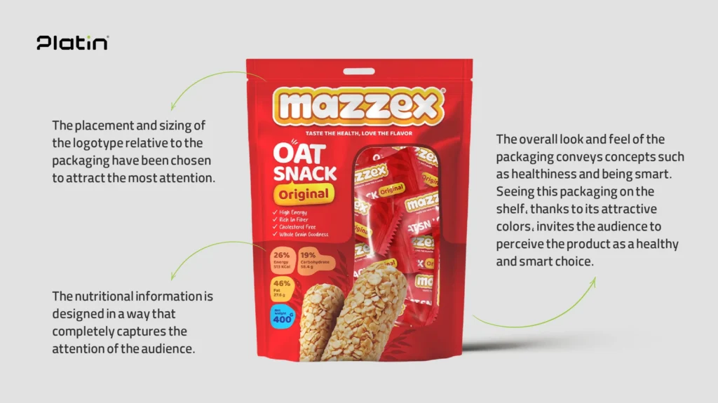
Mazzex, a brand specializing in healthy oat-based snacks, partnered with Platin Agency to introduce its new product line to the market. One of the brand’s main requirements was to design packaging that would stand out clearly on store shelves while communicating the product’s authenticity to consumers. This was particularly crucial because, in the previous packaging design, the brand name “Mazzex” was not given enough prominence. Instead, the word “OAT” was displayed in large, bold lettering, which created opportunities for unauthorized producers to misuse the term and flood the market with counterfeit products leveraging the “OAT” label, undermining Mazzex’s brand integrity.
Research and Insights
Extensive research revealed the core qualities of the Mazzex brand: its products are natural, energizing, and healthy. In addition, the concept of “enthusiasm” was identified as a defining element of the brand’s identity. Audience analysis further showed that consumers want to clearly see what is inside the packaging. Product information is highly important to them — particularly details about fat content, ingredients, and other nutritional attributes. Consumers also expect the product name to be highly visible and prominently placed on the packaging for easy recognition.
Strategy
The main strategy was to ensure that the packaging would stand out on crowded store shelves and immediately draw customers’ attention. It was also clear that the “Mazzex” brand name needed to be far more prominent to strengthen consumer trust and brand recognition. Therefore, the final design prioritized making the “Mazzex” logo more noticeable while reducing the size of the “OAT” word, which had previously overshadowed the brand name. Given the product’s healthy nature, which might not automatically spark excitement at first glance, we decided to incorporate a dynamic and energetic concept into the visual identity to attract consumers more effectively.